
In the competitive landscape of digital products, visual balance emerges as a pivotal principle that transforms user interfaces into seamless experiences for SaaS platforms.
As a specialized SaaS UI UX design agency, we consistently apply this concept to craft dashboards and applications that feel intuitive and professional from the first interaction. Understanding what is visual balance allows designers to distribute elements harmoniously, preventing overwhelming clutter.
The visual balance definition centers on achieving perceptual equilibrium through careful consideration of size, color intensity, texture, and positioning within a composition. This foundational approach not only elevates aesthetic appeal but also directly contributes to improved navigation.
In this Design Journal article, we will explore the timeless principles underpinning visual balance, from leading lines to the golden ratio, alongside practical applications in contemporary design.
We’ll delve into key types including symmetrical for structured trust, asymmetrical for vibrant engagement, and radial for focused centrality in SaaS interfaces. Finally, essential techniques like color modulation and grid utilization will provide actionable insights to refine your projects seamlessly.
What is visual balance?
Visual balance refers to the equitable distribution of elements within a design to create a sense of stability and harmony. Understanding what is visual balance helps designers craft compositions that guide the eye naturally and evoke emotional resonance.

Defining the principle of visual balance
The visual balance definition encompasses the perceived equilibrium of elements based on their size, color, and position in a composition. This principle addresses how viewers intuitively assess “weight” in visuals, much like physical objects on a scale.
Designers must consider factors such as texture and contrast to prevent any area from dominating the overall layout. Without a clear grasp of visual balance in design, compositions can appear chaotic or unfinished, leading to viewer disengagement.
The balance visual approach involves intentional placement to unify disparate elements into a cohesive whole. Ultimately, mastering this principle transforms ordinary layouts into professional, polished works that communicate effectively.
Why does visual balance in design matter?
Visual balance in design fosters a psychological sense of order, making user interfaces and graphics more intuitive for users to navigate. It enhances readability and user retention, ensuring key messages stand out without competing for attention.
Balanced designs also build trust, as they convey professionalism and thoughtful craftsmanship to audiences. Ignoring visual balance can result in cluttered visuals that frustrate viewers and dilute brand impact over time.
What is visual balance becomes evident in its ability to evoke calm or energy, depending on the project’s goals. By prioritizing this element, designers create user experiences that resonate deeply and encourage prolonged interaction.
How to balance visual in design?
Mastering how to balance visual in design requires a systematic approach to element arrangement and weight assessment. This process not only stabilizes compositions but also amplifies their emotional and communicative power.

Assessing visual weight of elements
Visual weight determines how elements attract the eye based on attributes like size, color intensity, and complexity in a layout. Larger or darker components naturally pull more focus, requiring careful counterbalancing with lighter counterparts.
Designers should sketch thumbnails to intuitively evaluate and adjust these weights early in the creative phase. Misjudging visual weight often leads to lopsided designs that feel unstable and unprofessional to observers.
Balance visual techniques involve ranking elements by their perceptual heaviness before final placement decisions. This assessment step ensures every part contributes harmoniously to the overall composition’s flow.
Applying symmetrical and asymmetrical balance
Symmetrical balance mirrors elements across a central axis for a formal, stable appearance in graphic layouts. It suits corporate branding where reliability is key, using identical shapes and colors on both sides.
Asymmetrical balance, however, offsets unequal elements through contrast to inject dynamic energy without chaos. Transitioning between these types allows designers to adapt to project moods, from serene to vibrant effortlessly.
Visual balance in design thrives when asymmetrical setups counter a bold image with clustered text blocks. Experimenting with both reveals the subtle art of maintaining equilibrium through varied visual tensions.
Incorporating radial and mosaic techniques
Radial balance arranges elements around a central focal point, creating a natural pull toward the core of the design. This technique excels in infographics, where spokes radiate like a wheel to emphasize unity and importance.
Mosaic balance scatters uniform elements evenly, fostering organized chaos for textured, immersive backgrounds. These methods expand creative options beyond linear arrangements, adding depth to visual storytelling.
What is visual balance here lies in the even distribution that avoids hierarchy overload in complex pieces. Designers benefit from layering radial hubs with mosaic fills for multifaceted compositions that captivate.
Using grids and negative space for structure
Grids provide invisible scaffolds that align elements precisely, promoting consistent spacing in multifaceted designs. They facilitate modular layouts, ensuring scalability across devices without compromising harmony.
Negative space, the empty areas, acts as a counterweight, preventing overcrowding and enhancing focal clarity. Combining grids with ample negative space breathes life into dense information-heavy visuals effectively.
Balance visual strategies rely on this duo to create rhythm and pause in user journeys. Overlooking them results in cramped works, but mindful use elevates simplicity to sophisticated elegance.
Experimenting with color, size, and position
Color influences perceived weight, where bold hues demand more space than muted tones in balanced schemes. Adjusting sizes proportionally counters dominance, pairing large neutrals with vibrant accents strategically.
Position shifts guide eye flow, placing heavy elements low for grounded stability in compositions. Iterative experimentation refines these variables, turning initial sketches into refined masterpieces over time.
Visual balance definition expands through trial, revealing how subtle tweaks harmonize disparate parts. This design process not only solves imbalances but sparks innovative expressions unique to each designer.
Top 3 Principles of visual balance
Core principles underpin visual balance, offering timeless tools to elevate compositions from functional to unforgettable. These foundational elements interweave seamlessly, guiding creators toward intuitive and impactful results every time.

1. Leading lines
Leading lines serve as pathways, directing viewer gazes from edges toward key focal points within any frame. They create momentum, transforming static images into journeys that unfold naturally across the surface.
Curved or straight, these guides enhance depth, pulling attention with purposeful elegance. In practice, leading lines converge to amplify emphasis, like roads funneling toward a horizon in landscape photography.
This principle strengthens visual balance by distributing interest progressively, avoiding abrupt halts. Designers harness them in layouts, ensuring smooth transitions between sections for cohesive flow.
Subtle integration of leading lines prevents overt manipulation, allowing organic discovery in complex visuals. They counterbalance dense areas, lightening loads through implied motion that invigorates the whole.
Mastery here refines what is visual balance, turning guidance into an artful conversation with the target audience.
2. Negative space
Negative space breathes life into designs, defining shapes through absence rather than accumulation of forms. It fosters clarity, permitting positive elements to emerge sharply against minimalist backdrops.
This principle underscores visual balance definition by equating voids with substance in equilibrium. Strategic deployment of negative space isolates motifs, creating pauses that heighten dramatic tension in posters or interfaces.
It mitigates clutter, promoting readability where every breath counts toward overall serenity. Examples abound in iconic logos, where simplicity reigns supreme through thoughtful omission.
Balancing negative space demands restraint, as excess yields isolation while scarcity breeds chaos in compositions. It interacts dynamically with adjacent principles, amplifying contrasts for layered depth.
Embracing this elevates balance visual strategies, crafting spaces that invite lingering appreciation.
3. The golden ratio
The golden ratio, approximately 1.618, proportions elements for innate harmony found throughout nature and art alike. It divides canvases into spirals or rectangles that guide placements organically without rigid rules.
This mathematical elegance ensures visual balance in design feels effortlessly proportional. Applying the golden ratio involves overlaying spirals to position subjects at intersection points for magnetic pull.
Historical icons like the Parthenon embody it, proving its cross-cultural resonance in architecture and beyond. Modern tools digitize this, simplifying adoption for precise, aesthetically superior outcomes.
Flexibility defines the golden ratio’s strength, adapting to asymmetrical needs while anchoring symmetrical cores steadfastly. It tempers experimentation, providing a benchmark for refinements that sustain long-term appeal.
Integrating it deepens understanding of visual balance, blending science with creative intuition seamlessly.
| Principle | Role in Balance | Visual Effect | Application Tips |
|---|---|---|---|
| Leading Lines | Guides eye along paths | Creates flow and direction | Roads in photos, arrows in UI |
| Negative Space | Counters positive elements | Provides breathing room | Ample whitespace in layouts |
| Golden Ratio | Proportional divisions (1:1.618) | Natural harmony | Spirals in logos, grid overlays |
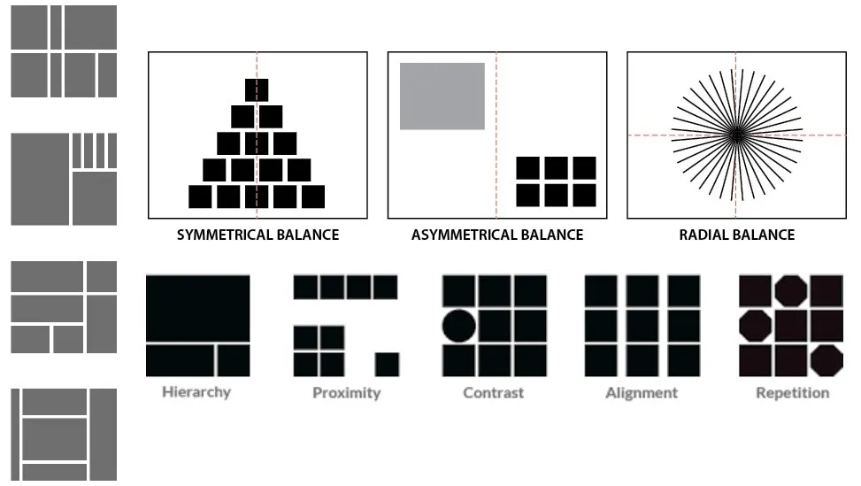
3 Types of visual balance
Exploring the three primary types illuminates pathways to tailored stability in diverse design scenarios. Each variant serves unique moods, from serene to vibrant, enriching creative arsenals profoundly.

1. Symmetrical balance for structured stability
Symmetrical balance mirrors components across a vertical or horizontal axis, evoking order and trustworthiness instantly. Ideal for formal branding, it aligns equal weights on both sides for unwavering poise. Classic examples include bilateral logos that exude professionalism without effort.
This type thrives in environments demanding reliability, like financial dashboards where predictability reassures users. It minimizes distractions, channeling focus symmetrically to core content areas effectively. Slight deviations prevent monotony, infusing subtle life into rigid frameworks.
Sustaining symmetrical balance requires vigilant alignment, using guides to match scales and tones precisely. It complements minimalist aesthetics, where uniformity amplifies elegance in print or digital realms. Adopting this fosters visual balance in design that stands the test of scrutiny.
2. Asymmetrical balance for dynamic energy
Asymmetrical balance offsets unequal elements through clever contrasts, generating movement without sacrificing steadiness. It suits contemporary narratives, where a hefty image counters lighter text clusters dynamically.
This approach invigorates ads, drawing eyes along unpredictable yet controlled paths. Energy emerges from deliberate disparities, like bold colors balancing sparse neutrals in editorial layouts.
It encourages creativity, breaking free from mirrors to explore organic distributions freely. Calibration via thumbnails ensures equilibrium, turning potential chaos into captivating harmony.
In UX contexts, asymmetrical balance guides interactions fluidly, mirroring real-world asymmetries for relatability. It avoids stagnation, injecting vitality that boosts dwell times on engaging pages. Mastering this type redefines balance visual possibilities, embracing imperfection as strength.
3. Radial balance for centered focus
Radial balance arranges items around a nucleus, emanating outward in concentric waves for magnetic centrality. Perfect for infographics, it funnels attention inward before expanding explorations outward. Natural motifs like sunflowers inspire this, radiating symmetry in circular grace.
Focus intensifies at the core, with spokes distributing secondary details evenly around the pivot point. This type excels in hierarchical displays, prioritizing essentials while supporting peripherals cohesively.
Adjustments in spacing maintain rhythm, preventing radial sprawl from diluting impact.
Versatility shines in radial applications, adapting to menus or icons where unity meets accessibility seamlessly. It harmonizes with other types, layering depth onto flat surfaces effortlessly. Employing radial balance enriches what is visual balance, creating worlds within worlds.
| Type | Description | Characteristics | Best For | Example Applications |
|---|---|---|---|---|
| Symmetrical | Mirror-image elements across an axis | Formal, stable, predictable | Branding, logos, formal layouts | Corporate websites, invitations |
| Asymmetrical | Unequal elements offset by contrast | Dynamic, energetic, modern | Posters, web dashboards | Editorial designs, ads |
| Radial | Elements radiate from a central point | Focused, unified, circular | Infographics, menus | Circular logos, dashboards |
Techniques for achieving visual balance
Practical techniques demystify visual balance achievement, offering hands-on methods to refine any composition swiftly. These strategies blend intuition with precision, empowering designers across skill levels confidently.

Balancing elements with color and contrast
Color balancing starts with hue selections that modulate perceived densities, using warms to anchor cools in equilibrium. High contrast edges sharpen definitions, while soft gradients ease transitions for subtle poise.
This interplay ensures no palette overwhelms, fostering unified vibrancy throughout. Contrast techniques heighten drama, pitting lights against darks to redistribute weights dynamically in scenes.
Monochromatic color schemes with tonal variations maintain cohesion, avoiding jarring shifts that disrupt flow. Layering opacities refines subtleties, tailoring intensity to compositional needs precisely.
Holistic application views color as connective tissue, weaving threads that bind disparate parts cohesively. It responds to cultural contexts, where bold primaries evoke energy in Western designs specifically.
These methods solidify visual balance definition, painting equilibrium with purposeful strokes.
Leveraging negative space and proximity
Negative space leveraging carves intentional gaps, framing subjects to amplify their presence amid vast expanses. Proximity clusters related items, forging alliances that lighten isolated heaviness effectively. Together, they sculpt rhythms, alternating density with respite for breathing compositions.
Proximity rules dictate groupings, where tight bonds imply connections and loose ones suggest independence clearly. Negative space encircles these, providing contextual buffers that enhance legibility in dense arrays.
This duo navigates complexity, turning potential clutter into navigable landscapes. Adaptive use scales with project scopes, from sparse billboards to intricate interfaces demanding precision.
It honors viewer psychology, where ample voids reduce fatigue during prolonged engagements. Such leveraging cements balance visual foundations, inviting discovery through spatial poetry.
Using grids and focal points effectively
Grids anchor focal points, modularizing canvases to position anchors at intersections for gravitational pull. Invisible lines enforce consistency, scaling elements proportionally across varied formats seamlessly. This structure liberates creativity, bounding chaos within ordered parameters effortlessly.
Focal points command centrality, amplified by surrounding grids that radiate support without competition. Techniques like the rule of thirds pinpoint placements, aligning peaks with natural gaze patterns intuitively.
Refinements through cropping sharpen dominance, ensuring singular narratives prevail. Effective deployment iterates between grid rigidity and focal flexibility, harmonizing constraints with expression.
It suits responsive design, where adaptive modules preserve integrity across devices uniformly. These uses exemplify visual balance in design, structuring freedom with architectural finesse.
| Technique | How It Works | Key Benefits | Common Tools/Examples |
|---|---|---|---|
| Color and Contrast | Use hue/saturation to adjust weight | Adds depth, guides eye | Warm vs. cool tones in palettes |
| Negative Space and Proximity | Carve voids; cluster related items | Enhances clarity, reduces clutter | Minimalist branding (e.g., Apple) |
| Grids and Focal Points | Modular alignment; central anchors | Ensures scalability, hierarchy | 12-column grids in UI design |
Conclusion
Mastering visual balance unlocks boundless potential, transforming ordinary designs into extraordinary experiences that linger. As creators continue experimenting, this principle remains an enduring ally in the quest for visual eloquence.
Embrace its nuances to craft legacies that resonate timelessly with every beholder. In reflecting on our journey through principles, types, and techniques, the true power of balance visually emerges in its adaptability.
From symmetrical serenity to radial radiance, each facet equips designers to meet diverse challenges head-on. Future innovations will likely amplify these tools, but the essence endures in human intuition.
Ultimately, what is visual balance transcends mechanics, becoming a dialogue between maker and audience. Commit to practice, and watch compositions evolve from stable to sublime effortlessly.
Your next project awaits this harmonious touch begin balancing today for tomorrow’s triumphs.
Frequently asked questions
What is meant by visual balance?
Visual balance refers to the equitable distribution of visual weight across a design’s composition, ensuring no single area feels heavier or more dominant than another. It fosters a sense of stability and harmony, guiding the viewer’s eye naturally while evoking completeness and user satisfaction.
How to achieve visual balance?
To achieve visual balance, assess elements’ visual weight based on factors like size, color, and texture, then distribute them thoughtfully using symmetry for stability or asymmetry for energy.
Incorporate negative space for breathing room and grids for alignment, experimenting iteratively to ensure the overall layout feels harmonious and uncluttered.
What are the four types of visual balance?
The four primary types of visual balance are symmetrical, asymmetrical, radial, and mosaic, each offering unique ways to create equilibrium in designs.
Symmetrical mirrors elements for formal poise, asymmetrical uses contrasts for dynamism, radial radiates from a center for focus, and mosaic scatters evenly for textured unity.
What are the 9 visual balance techniques?
Nine key techniques for visual balance include symmetrical mirroring, asymmetrical contrasting, radial centering, texture varying, negative space leveraging, and alignment gridding, each addressing different aspects of weight distribution.
These methods, drawn from design principles, allow creators to fine-tune compositions for harmony, with color and space often proving most versatile across mediums.
Leave a Reply